.
Fly Airlines
Mobile App
.
F.
TAGS
1. USER RESEARCH, ANALYSIS, INTERACTION DESIGN, PROTOTYPING, WIREFRAMING.
2. BRANDING, INTERFACE DESIGN.
INTRO
Fly Airlines is a fictive project created by the UX Design Institute, a university credit-rated online course that teaches the UX design process. This is the journey I embarked on to get a professional diploma in UX design and learn about the mindset and skills essential to any UX designer.

PROBLEM STATEMENT
Most airline apps are difficult to navigate, have crowded interfaces and can make users feel frustrated.
BUSINESS GOAL
Create a booking experience that is easy and intuitive, preventing users from leaving the booking process mid-way.
Design Process.
01
Research.
Competitive benchmarking
Online surveys
Usability testing
Depth interviews
02
Analyze.
Affinity diagram
Customer journey map
03
Ideate.
Flow Diagram
Interactions
04
Design.
Prototyping
Testing
Wireframing
05
Interface
Branding
Screens Design
01
Research
LOOK UP THE COMPETITION, LEARN FROM THEIR MISTAKES AND TAKE NOTES.
Since Fly Airlines is a fictive company, the natural way to start was by looking up the competition. I kept my research open for mobile and laptop and reviewed Air France, Easy Jet, Hawaiian Airlines and Momondo.
Competitive Benchmarking Mobile App
Competitive Benchmarking Desktop Web
Results from survey
USERS ARE YOUR GUIDELINE. METRICS ARE A MIND READER.
To collect further information about the booking process, I conducted an online survey with 30 people. The results gave me a deeper understanding of users’ expectations when booking a flight.

FINDINGS
“I would like more price visibility for alternative dates”
Price, price and price!
Users want to see price points across the booking, it helps them make explicit decisions.
Clear Info
Users want to see clearly: direct flights, stopovers, duration. They don’t want to look for it or be misled.
Progress bar
Users like to be guided and know the length of the booking process.
Stressful Booking
Users are hoping to lessen the anxiety they feel when starting their booking.
How to start?
Promotional banners are often intrusive and distract from the actual booking.
PLANNING, BOOKING, EXPLORING? TALK TO USERS, THEY WILL WHISPER SOME GREAT INSIGHT.
This research step was planned during the COVID-19 pandemic, highly preventing in-person meet-ups, so I gathered additional data by conducting remote in-depth interviews.

Remote Usability Test

Remote Usability Test
DID YOU SAY PRICE? HE SAID STOPOVERS! ONLY TESTS WILL REVEAL THE WHOLE TRUTH.
I conducted usability tests on the competition apps, the objective was to measure if users could easily and flawlessly book a flight and point out problems while doing so.


FINDINGS
“If I want to book at the end of 2021, I have to scroll a lot.”
Top priorities
Price and dates need to align to help users make a decision.
Saving Search
Saving search can make users skeptical. Users think if they show too much interest in a specific flight, the price will go up on their next visit.
Recent Search
Users think that a recent search is a good way to save time.
Total amount
Always give clarity of the total amount of the trip. Users invest their time in this process, it’s important to avoid bad surprises.
Endless scroll
If users want to book a further date in the calendar year, it evolves too much scrolling.
Filters
Filter the search with checkboxes to customize users’ search
02
Analyze
LET’S BRIDGE THE GAP BETWEEN RESEARCH AND DESIGN
To combine the large amount of raw data collected through my research, I created an affinity diagram. To achieve this, I ran a remote session on Miro with my dear friend Antoine Desmeliers, a UX designer in Tokyo.


Phase 1: Write down notes
Phase 2: Sort out
Phase 3: Finalize
EMBARK ON THE USER JOURNEY. FOLLOW THE DETAILED MAP.
I segmented each stage of the booking process based on the user goals, behaviours, context, pain points and mental models. It helped me make further choices based on the user journey without missing any essential data.

Customer Journey
CONSIDERATIONS
Simplicity
The interface needs to be simple and straight to the point, avoid distractions.,
Priorities
Users’ top priorities are price, duration and stopovers. Make sure users have access to this info clearly, across the experience.
Preferences
Users would like to see their preferred settings in order to save time every time they visit.
Price Fluctuation
Users hate price fluctuation between two visits, Fly airlines needs to help reduce the frustration.
Scrolling options
Some users like scrolling but others don’t. Need to give alternatives.
Share trip
Users like sharing their trip, either to get an opinion or a confirmation from friends and family.
03
Ideate
FROM THE FIRST SCREEN TO THE LAST, MAKE IT FLOW.
The unstructured data were finally organized into detailed documents, highlighting the areas of improvement and pain points encountered by users. This analysis helped me define a high-level flow diagram, focusing on the primary use case.


Flow Diagram
DRAW THE EASIEST BOOKING PROCESS.
Once the user flow was clearly identified, I started to sketch all screens on paper and finalize it on Procreate and Keynote.


Sketching

Adding notes
Overview
04
Design
LET’S ADD MORE INTERACTIVITY.
To create my medium-fidelity prototype, I started laying all screens down on Sketch, I then added interactions on Figma.


Remote Usability Test

Remote Usability Test
These usability tests revealed the following points:
Users were confused by the yearly calendar, what I thought will be a solution to the calendar scrolling issue became confusing to users.
The price’s color code wasn’t clear enough, users would like to see the price for each day.
Users would like to share the trip with friends and/or family members but they usually screenshot it.
I took notes and revised my final medium-fidelity prototype.
“I’m curious to see what the final interface look like”
05
Interface
Fly Airlines’ newness makes it an outsider in the industry.
To play on this outsider theme, I chose to create a futurist and disruptive look. “Don’t be indifferent, be the difference”

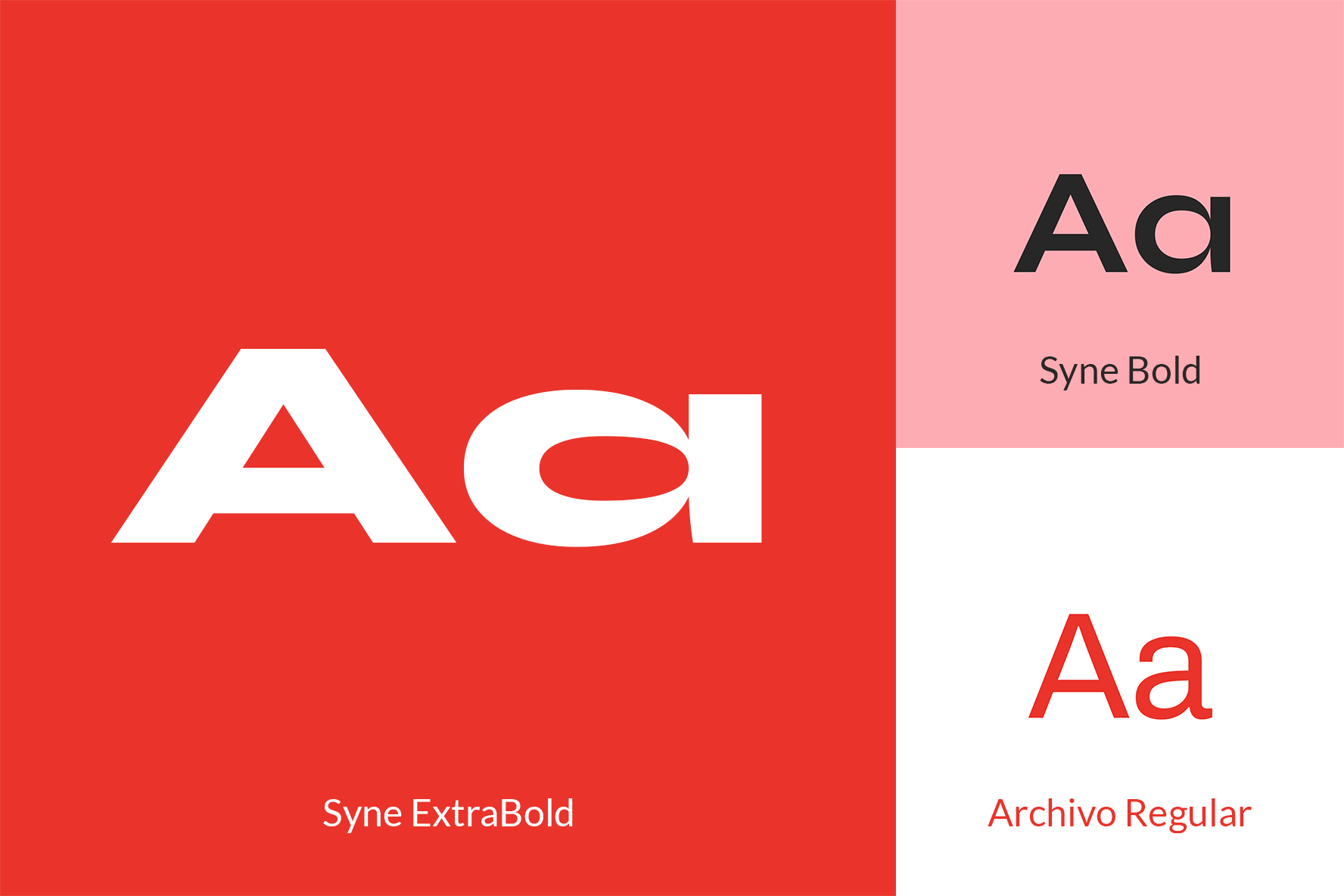
Fonts

Colors

Final Interface
